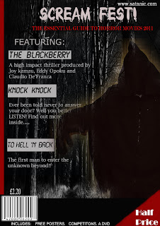
As you can see, with the help of my research on film magazine covers, I have been able to incorporate some ideas into the making of my own magazine cover. Take for example the use of the bold heading. I decided to use the blood dripping font on my magazine cover to help give a hint of its genre. I also chose to use the colour white so that it stands out from the dark gloomy background. Overall, I used a colour scheme of white, red and black. I decided not to use bright colours such as yellow, blue and others as this would ruin the spooky horror effect.
I also tried attracting my targetted audience by including freebies, dvd's, posters and a competition. As well as this, I made sure that my magazine price was a shocking £2.20. This made it affordable and more likely to be bought by all classes. To make it clear of the price of this magazine, I included a "Half Price" note on the bottom right of my magazine. It was in a bold white font to help attract my audiences attention. With the production of my magazine cover, I have included features that most magazine covers use. I included a barcode, a simple layout, bold texts, an image, website, Heading, information, attractions and a cheap price. All these would hopefully complete my magazine cover and attract my targetted audience.

No comments:
Post a Comment