Wednesday, 15 December 2010

My final film poster

This is my final film trailer poster " The BLACKBERRY"

 Researching on horror film posters gave me the idea of using dark colour schemes. In this case I chose to go with a simple black, red and white colour scheme. I also used this same colour scheme in the making of my magazine cover. This also helped reveal the genre of the film being advertised and helped with the mise-en-scene. Including the quote at the top of the poster, helped to give a hint to the audience of what to expect as well as get them a little bit scared. All this helps to set the atmospheere for the film. I purposely surrounded the text in a red rectangular shape to help it stand out. The inclusion of the age certificate made the audience aware of  who were legally permitted to view the film. To help determine the title of the film being advertised,  I ensured that the title was in an obvious big red font. Doing this helped to attract attention and make it visable amongst all the other texts. As most of the scenes in our film trailer were set in the woods, I tried to incorporate this setting in both my film poster and magazine cover. Doing this helped to keep the same house style and mise-en-scene. To keep the horror/thriller genre, I included haunting eyes in the background and the scared expression on my actors face. To help emphasise on the title of the poster, I made my actor hold a "blackberry" in both hands. I finally finished my film poster by adding credits which included the names of the producers and directors of the film. To keep my audience in the dark, I did not reveal the release date of the film and instead wrote "COMING SOON".

Tuesday, 14 December 2010

Stages for my film poster (drafts)

These are the stages I went through to complete my film poster. As you can see through the pictures, I have changed and improved some aspects of my poster.

Monday, 13 December 2010

Poster sketch/plan

Below is a hand drawn sketch/plan of what my poster might look like. I might not necessarily follow my original idea but it is still a starting point for my production.

Planning: Potential pictures to use for film poster and magazine cover

These are a few of the images I wanted to use for my film magazine cover and Film poster.


Auxillary task Research on Horror/Thriller film posters

As well as producing a trailer, one of our auxillary tasks was to create a film poster for our film trailer. This film poster was to help give a hint of what our trailer might be about. To get a general idea of what film posters included, i decided to reseach on a couple of posters.

I researched different film posters for my auxillary tasks. Researching these posters will hopefully allow me to pick out key features that will help with my film poster. At first glance, its obvious that the dark colours used in these posters help make the genre very clear. This is a technique that i might use in my own film poster. As well as this, the camera angles used emphasises on who the main character or characters are. Looking at the tittle of the film, bold letters are used to attract its targetted audience and makes it stand out.  All these techniques have been thought of by the film poster producer in advance. Every image and writing used is thouroughly analysed before use.   

The film posters also includes the date of releaase, the website and sometimes quotes from newspapers or film critics. It is also evident that there aren't a lot of text on the poster, however, any texts on the poster are normally placed on the outside of the poster. This ensures that the focal point of the poster stays on the center image, closely followed by the film title.
So with these posters in mind, I will hopefully apply some of the skills used to help improve and perfect my film poster.


Sunday, 12 December 2010

Analysis of my Film magazine cover

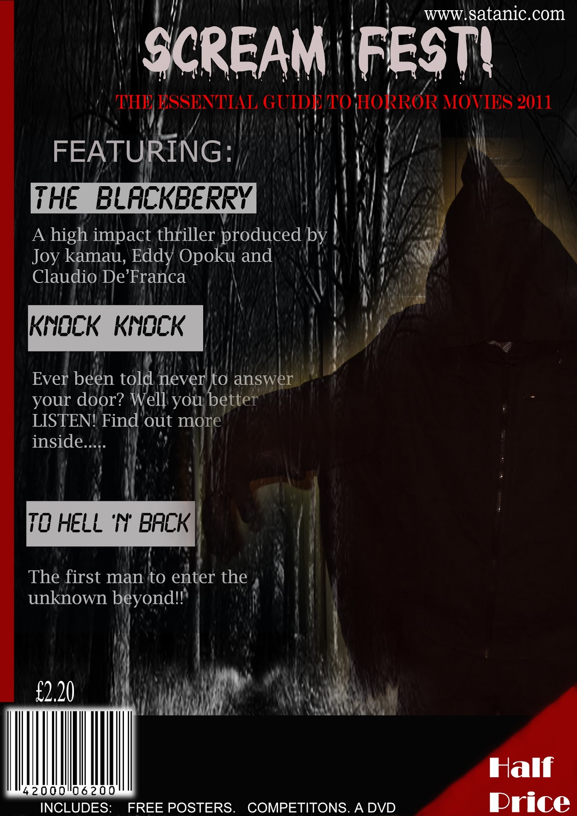
As you can see, with the help of my research on film magazine covers, I have been able to incorporate some ideas into the making of my own magazine cover. Take for example the use of the bold heading. I decided to use the blood dripping font on my magazine cover to help give a hint of its genre. I also chose to use the colour white so that it stands out from the dark gloomy background. Overall, I used a colour scheme of white, red and black. I decided not to use bright colours such as yellow, blue and others as this would ruin the spooky horror effect.

From researching, I was able to learn that most magazines placed their text around a main image. This is exactly what I did. Doing this allowed my front cover to have a focal point. In this case my focal point was the hooded figure on the right hand side of my magazine. Placing my text on the left hand side ensured that it didnt get in the way of my image, but still attracted the readers attention with its black on white font.

I also tried attracting my targetted audience by including freebies, dvd's, posters and a competition. As well as this, I made sure that my magazine price was a shocking £2.20. This made it affordable and more likely to be bought by all classes. To make it clear of the price of this magazine, I included a "Half Price" note on the bottom right of my magazine. It was in a bold white font to help attract my audiences attention. With the production of my magazine cover, I have included features that most magazine covers use. I included a barcode, a simple layout, bold texts, an image, website, Heading, information, attractions and a cheap price. All these would hopefully complete my magazine cover and attract my targetted audience.

Saturday, 11 December 2010

Stages of my film magazine draft

These are the steps I went through, to come up with my final film magazine cover. In every picture, I have changed, corrected or added a new feature.